Bringing Citizen Science Data to Life
Data visualization makes it possible to show relationships, patterns, and trends in data and it helps communicate information clearly and efficiently, makes complex issues more understandable and is ultimately a fusion of scientific data and design. By presenting data in its entirety, new insights can be gained. Especially in Citizen Science Apps with a spatial reference, visualizations directly embedded in the map offer the possibility of better understanding data and relating one's contributions to the whole data set of the project.
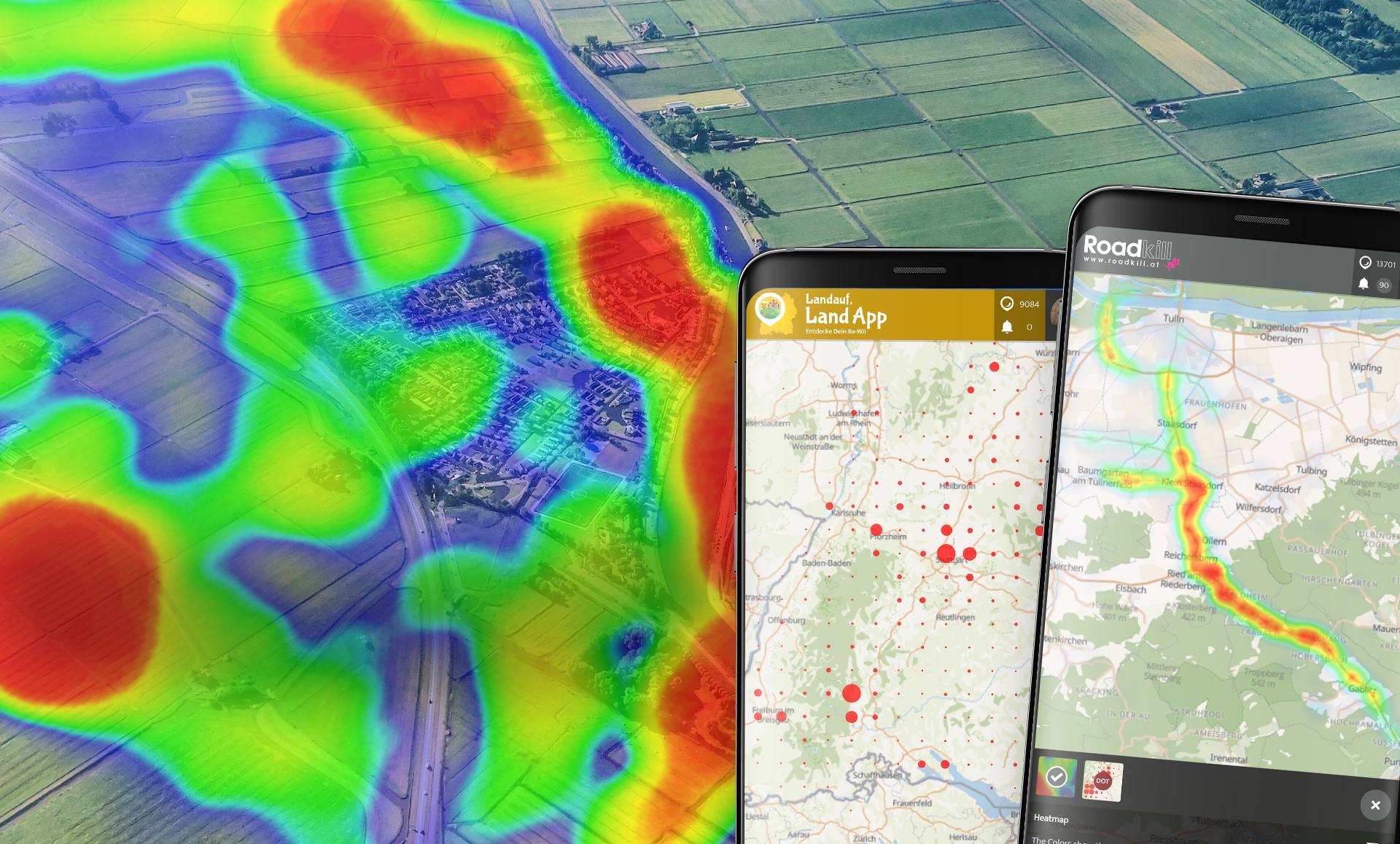
To make this connection between data and Citizen Science Apps, the Data Visualization Overlay interface is present in all project Apps, running on the SPOTTERON platform. The interface is accessible with just one touch right on the map and opens up the section, which houses all data visualizations available within a project with the distribution heatmap and the dot map as two standard options. The visualizations adapt seamlessly to each zoom level or to moving the map. There are already two data visualization types to choose from in all apps: a "Heatmap", which shows the density of spots in colour gradations on the map, and a "Distribution Dot Map", where the distribution of spots is resolved in a grid with the size of a circle representing the number of posts. More extensive and complex overlays will be added in the future.
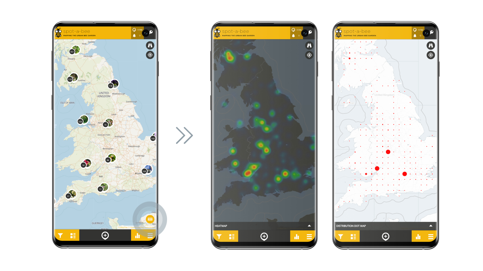 Example from the Spot-A-Bee Citizen Science App running on the SPOTTERON platform: an area with many spots (left) and visualized with heat map and dot map (right).
For the display of the data visualizations, we have designed and implemented two new map styles for the Citizen Science Apps. These map designs support the visual strength of particular overlays, by having a bright version and a dark version allowing for a good contrast with the visualization itself. The map style is also reduced, so there is no map information interfering with the clarity of the data visualization.
In addition to selecting categories (depending on the Citizen Science project, e.g., plant or animal species or object types), the data visualization overlay display can also be further filtered. Time spans and years can also be set without waiting times. These filtered heat maps or distribution maps also allow an animation to be played, in which the entries in the Citizen Science App are taken live as the data basis and displayed as data visualization.
Extendable and flexible: Custom Citizen Science Data Visualizations
On the SPOTTERON Plattform, we always design functionality with extendability in mind. The same applies to the Data Visualization Overlay, which can be further built on by all other projects, which can bring new and custom data visualizations with them. As with all the features for Citizen Science Apps, we stand ready to develop new functionalities during a project's runtime and once implemented, all other projects on the platform can adopt such a new feature without additional development costs. This principle, that we can the "Feature Ecosystem" applies also to new data visualizations - once implemented, all projects on SPOTTERON can use the new way to display and summarize data in their own Citizen Science App.
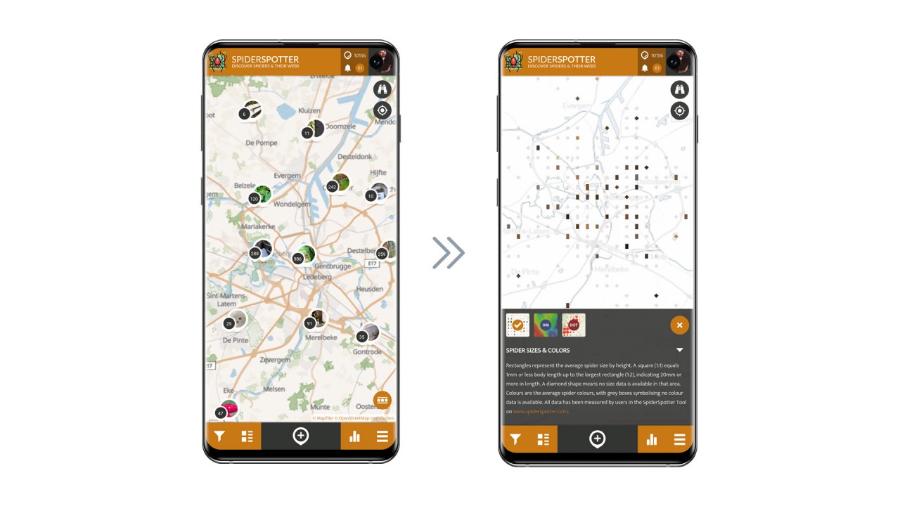 Example for a Custom Data Visualization Overlay in the SpiderSpotter Citizen Science App running on the SPOTTERON platform showing spider sizes and colors.
The Technology of Data Visualizations in Citizen Science Apps
Data Visualizations can be a challenge - especially if implemented in public participatory smartphone apps. Performance is a key in that area, which makes it necessary to run a fast and reliable technology infrastructure behind the curtain. We have built and set up new web services and server components on the SPOTTERON ICT Cloud to provide a smooth and responsive data visualization functionality. This service offers a flexible and performant backbone for quick and smooth data handling based on advanced caching and indexing technologies. All projects on SPOTTERON can use this new technology in their Citizen Science App right from the start and include existing or custom-built live data visualizations in their projects.
If you are interested in learning more about the Data Visualizations, built into Citizen Science App, or want a live demonstration, please write us a quick email